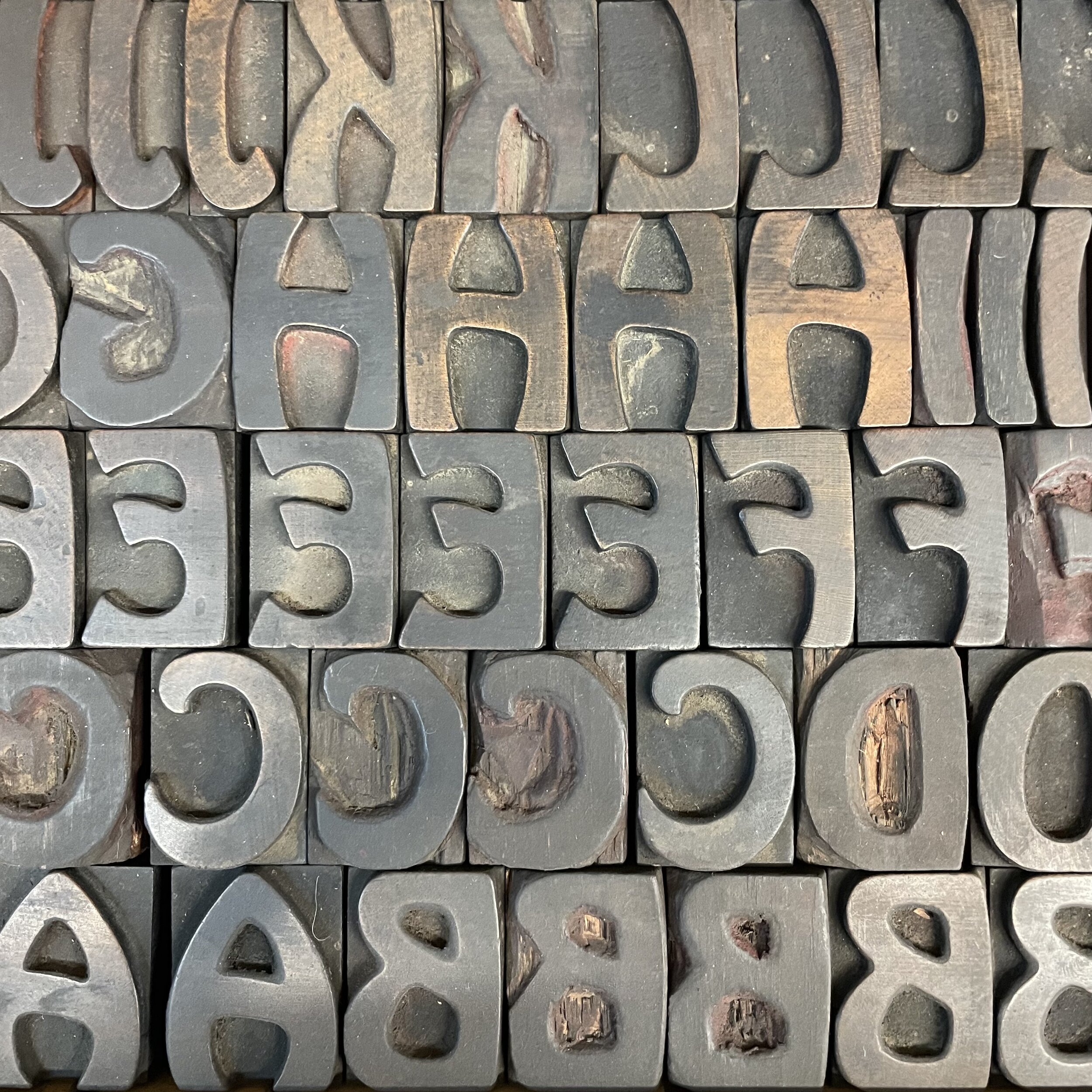
WOOD TYPE: HOBO
Hobo was designed in 1910 as a metal typeface by a prolific typeface designer named Morris Fuller Benton, who designed over fifty typefaces during his career. The Hobo typeface was later manufactured in wood-type by the Hamilton Company. Hobo has two interesting design features. First, all the letters are all composed of curved lines thus eliminating all of those pesky rigid straight lines. Secondly, none of the letters use descenders. Letters that normally have a descender are resized and moved up to fit in the allotted space for a letter with no descender. These features give Hobo a casual look that suggests informal applications such as invitations and advertising for fun events. Our sample “HOBO type” is an 8-line version that shows both upper and lower case to illustrate the design features. In preparation for the 100-year anniversary of Hobo, there are also a few websites that are soliciting Hobo sightings (photos showing use of Hobo typeface).


