
WOOD TYPE: KABEL

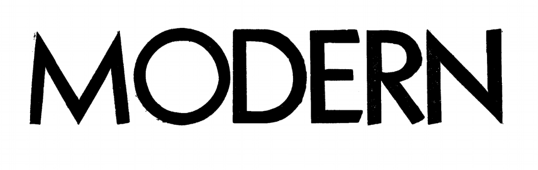
Kabel was named in honor of a transatlantic telephone cable completed in 1926. The typeface was designed by German designer Rudolph Koch and released in 1927 as a metal typeface by the Klingspor foundry in Germany. Kabel is a geometric sans-serif design which appears to have been part of a design trend in Germany at the time that had already yielded one other geometric sans-serif design named Erbar and others, Futura and Berythold Grotesque, were in development. It was a successful metal type design and by 1932 Kabel and Kabel Bold were both shown in Hamilton’s wood-type catalog. Out sample “Modern” is an 8-line type Kabel Bold from Hamilton.
In addition to its geometric origin Kabel is characterized by some classical and even calligraphic influences that combine to yield a unique and less rigid look than some of the other geometric typefaces. Kabel retains the 30 degree rotated lower case “e” from an earlier era and most linear strokes end in an eight degree slant to perpendicular. These features plus others give Kabel its special look. It has enjoyed much popularity over the years where millions of people have seen it every day. People of all ages should recognize it from two widely seen applications; the NBC logo that appears on your TV station and the name in the middle of the Monopoly board. Kabel has also been used on TV shows, movie titles, and names of products and stores.